Wednesday, February 23, 2011

Lab 8: Precipitation


Analysis
The above document compares the precipitation during this season versus the seasonal average in Los Angeles County. The data used in this analysis was based on the data collected from 61 precipitation monitors maintained by the Los Angeles Department of Water and Power. Average precipitation, the recorded precipitation values for the 2010 season, and the difference between the 2010 season and average precipitation made up the three map themes. Two data interpolation techniques were used (splining and kriging), giving a total of six maps.

An elementary statistical analysis shows that precipitation monitors show that 2010 precipitation values were lower on average:


The maps confirm these results graphically. Under both interpolation techniques, it is difficult to come to any conclusions by individually comparing the normal season versus the 2010 season precipitation map. However, the two maps that calculated the difference between 2010 season and average precipitation data were much more clear. Regions with negative values (denoting less precipitation) are prominent in both cases. The kriging method, however, shows more areas less precipitation.

Prior to doing this lab, I had thought that splining would be the most accurate interpolation method for precipitation. I had thought that since the method was based on gradients and a 'best fit surface', it would better capture the natural flow of water. Surprisingly, I found that splining yielded very improbable (sometimes negative) values. These values were the result of an overestimation by the algorithm built into ArcMap. This occurred, for example, when there were many points in the south with high precipitation values while points in the north have very small precipitation values. The resultant interpolated values further north may become negative. The opposite also occured, giving me a value of approximately 200 inches of precipitation-- an extremely unlikely number given that the maximum recorded value was approximately 43 inches. For the same reason, however, I found that projected spline values positioned in the center of the map were realistic. In my opinion, kriging is more accurate because it is based off of a weighted average between points. When large differences in values exist, the kriging projected values are constrained by upper and lower bounds-- resulting in lower margins of error.
Monday, February 21, 2011

Lab 7: Fire Hazard

Tutorial


My Analysis


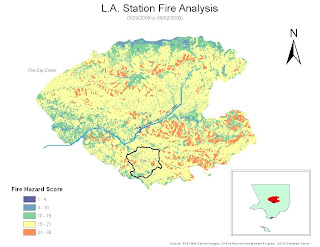
This map graphically displays the fire risk of the entire 2009 LA Station Fire area-- the region mapped is the entire area that was burned in the fire over the first five days. The map's data is from 2006 and 2008, meaning that the data should generally be consistent with the conditions prior to the LA Station Fire. The ‘Fire Hazard Score’ in the lower left hand corner incorporates slope and surface fuel type into the final score. A small score is a low fire risk area whereas a large score is high fire risk area. The small outlined portion is the extent of the fire at Day 1 (8/29/2009) and the entire colored region is the total extent of the station fire. To give map viewers a perspective on the size of the Station Fire, an inset map of LA County was provided. For reference, Big Tujunga Canyon Stream and Mill Creek were also plotted on the map.


The first step in creating this map was completing a similar tutorial provided by ESRI. The tutorial provided a walk-through of the primary steps necessary to complete the map. I was able to find GIS data from a variety of sources: UCLA GIS data (streams and county boundary), LA County Data (station fire perimeter), CA Fire Resource Assessment Program (surface fuels), and the USGS Seamless Server (elevation data). First, I merged the five day fire extent into one cumulative layer. Second, I made a hill shade layer to get a better feel for the study area. Next, I reclassified the surface fuel types so that more flammable vegetation types received higher scores. The same was done for the slope (higher slopes were deemed higher fire risks). Lastly, these scores were summed using the raster calculator and the final result is seen above.


I encountered a variety of problems in making this map. First, when I tried using the cumulative fire area as a mask, my result for slope was impossibly high-- I calculated changes of over 2 million percent. I found that if I used the LA County feature as a mask, this problem could be circumvented. Another problem I encountered was that I was not exactly sure how the surface fuel types/slope changes should be scored. I generally followed the tutorial for these scores, but some of the values were made using my best judgment. The last problem I encountered was independent of the GIS program—I had an inconsistent remote access connection with the UCLA lab computer.

Friday, February 11, 2011

Lab 5: Suitability Analysis


Kettleman Hills

The Kettleman Hills polychlorinated biphenyl (PCB) disposal facility is only one of ten in the nation. PCBs are highly toxic and have found to be carcinogenic in animals. Furthermore, the EPA suspects them to be cancer-causing in humans. In a 2010 report, the EPA found that the Kettleman Hills facility was improperly disposing of PCB materials—local air, soils, biota, and vegetation samples exceeded legal PCB levels by 2 to 400 times. For this reason, lawmakers have been hesitant to allow the facility to expand until further PCB research has been conducted. GIS and suitability analysis can be very helpful in objectifying whether the Kettleman Hills facility can be safely expanded given certain safety requirements.

A key concern among the Kettleman community is that an abnormally high rate of birth defects is linked to groundwater contamination from the PCB facility. I could analyze the problem with ARCGIS by performing a buffer analysis on the town’s aquifer to see if the facility is nearby existing water supplies. The region could incorporate slope (in relation to runoff), water table height, distance from aquifers, distance from population centers, and vegetation type, and soil permeability into a suitability analysis of the region surrounding the facility.

Each variable could also be individually weighted to reflect higher importance. The proposed expansion area around the Kettleman Hills facility could then be evaluated based on this suitability analysis.The Kettleman Hills facility suitability analysis could then be compared to other potential PCB disposal sites. These potential locations should be subjected to the same analysis to keep the figures consistent and to determine whether or not another area is more suitable. One difficult factor to measure is that the Kettleman PCB facility is only 3 miles from Kettleman city—a popular stop on CA Interstate 5. Although few residents live in the community, many people depend on its water.

In order to analyze the total effect of the PCB facility, Kettleman satellite images from before the facility was opened could be compared to Kettleman satellite images after the facility was opened. The vegetation cover could be made into polygons in each period and the change in land cover could be analyzed. This may prove to be useful in the case that some plants are especially susceptible to PCB contamination. If this method is effective, it would also show the range of PCB contamination.

GIS can help lawmakers make better decisions by summarizing scientific data in a condense and visual way. Although more complex layers can be at work, GIS helps identify and objectify the most immediate and pressing concerns. The above image is an example of results that could be reproduced for the Kettleman site.

Wednesday, February 2, 2011

Quiz #1: Marijuana


The above map depicts 12 schools and 13 churches that are currently within the 1000 foot buffer.


I am in favor of the proposed medical marijuana ordinance. Although few dispensaries are located 1000 feet away from areas where children congregate, restrictions should cap where no development can occur. As many Los Angeles residents have found, the growth of these stores from 2007-2009 years was extremely rapid. The ban would serve to prevent these stores from percolating into urban clusters.


A brief google search of ‘medical marijuana dispensaries’ shows that thirty one dispensaries exist within Los Angeles city alone. This suggests that even if some dispensaries are forced to close under the ordinance, patients that need medical marijuana have many other substitutes. The one thousand foot buffer from schools, churches, and other areas when children aggregate would also serve to relocate them from urban centers. In accordance with the ordinance goals, this would have the likely effect of reducing recreational pot use.