Monday, April 11, 2011

Lab 2: Santa Monica Mountain Insolation


In this week’s lab, I mapped the amount of insolation received by the Santa Monica Mountains in winter, spring, summer, and fall. The elevation data for the region was retrieved from the United States Geological Survey Seamless Server. The California state line and vegetation data were downloaded from a UCLA data set. Lastly, the sun angle data for each season was derived from the Susangle website.


Using the clip analysis tool, I narrowed the entire Santa Monica Mountain region to the area in the raster vegetation data. From the USGS DEM data, the slope and aspect maps were directly calculated using standard ARCGIS spatial analyst functions. In order to make more meaningful judgments, the exact angles from the aspect map were generalized to north, east, west, and south. In order to model the hillshade for each season, I referenced the Susangle website for the altitude and azimuth for the most representative days of each season (the solstice and equinox days). Lastly, the vegetation statistics were summarized using the ‘zonal statistics’ spatial analyst tool. The output of this function is the bar graphs seen below the seasonal insolation maps (figure 1).


The aspect map produced some interesting results: most of the sunlight seems to land on north and east facing slopes. When comparing the aspect map to the slope map, it can be seen that the eastward facing slopes seem to be only near the top of mountains while the northward facing regions are less correlated with elevation. In general, south facing slopes are the least common in the Santa Monica Mountain study area.


Comparing the amount of insolation received by vegetation type, the human dominated landscapes (urban/agriculture) received the most sunlight followed by annual grass, sagebrush, chamise, and oak. This probably occurs because people grow crops and live in the brightest areas. Although oaks have a higher canopy than the other vegetation types, they require better conditions to thrive. Therefore, it is unsurprising that other vegetation types receive more insolation.


The ratio of sunlight received by each vegetation type varies little between each season. However, the absolute amounts changed (a noticeable drop is evident in the winter). This may be caused by a flaw in the setup of this analysis. Since the vegetation boundaries change over time. A more accurate analysis could use different vegetation data for each season.

Wednesday, March 16, 2011

Final Project: In LA County, Are Low Income Populations Disproportionately Exposed to Point Source Emissions?

I. Introduction


Los Angeles County is notorious for its poor air quality. Historically, its air quality has been attributed to Los Angeles County’s heavy reliance on personal cars and lack of an expedient public transit system. Although this is true-- air quality monitors record increases in pollutant levels during commute times—a significant amount of pollutants stem from point sources through utility, commercial, and industrial processes. This research project will focus on whether low income populations are disproportionately exposed to pollutants from point sources in LA County.


My objective is to determine if point source emissions had a higher propensity to be situated near low income populations than high income populations—and if so, to what degree.


Carbon monoxide (CO), nitrogen oxides (NOx), and fine particulate matter (PM2.5) were chosen as the three pollutants to be analyzed. All three are regulated by the Clean Air Act. Of these pollutants, Los Angeles only exceeded national levels for PM2.5.


Carbon Monoxide
Carbon monoxide was chosen because approximately 70% of CO emissions in LA County stem from vehicular traffic. The top non-vehicle CO sources are fossil fuel combustion, industrial processes, and non-road equipment. CO was selected because I thought that since CO emissions fell within federally regulated limits, it might be easier for CO intensive facilities to infiltrate low-income communities. Prolonged carbon monoxide exposure can cause adverse health effects such as chest pain chest pain and can exacerbate existing conditions.


Nitrogen Oxides
In Los Angeles County, approximately two-thirds of nitrogen oxide emissions stem from sources other than vehicular traffic. Similar to carbon monoxide, the top non-vehicle CO sources are fossil fuel combustion, industrial processes, and non-road equipment.
Nitrogen oxides can result in inflamed airways and additional side effects in asthmatics. Nitrogen oxides can also increase the formation of smog.


Fine Particulate Matter (PM2.5)
PM2.5 is unique from the other two pollutants in a couple of ways. First, PM2.5 is the only pollutant of the three analyzed to be nonattainment. Second, industrial processes and nonroad equipment far exceed the amount generated by on road vehicles. Third, fine particulate matter has the most adverse side effects. Studies show that it can lead to decreased lung function, aggravated asthma, irregular heartbeat, chronic bronchitis, and nonfatal heart attacks.


II. Methods
Data was collected from four sources:
1. The UCLA GIS Database (http://gis.ats.ucla.edu/)
2. The US Census Bureau’s Fact Finder (http://factfinder2.census.gov/faces/nav/jsf/pages/searchresults.xhtml?ref=geo&refresh=t#none)
3. The US Census Bureau’s TIGERLINE Project (http://arcdata.esri.com/data/tiger2000/tiger_download.cfm)
4. The EPA National Ambient Air Quality Standard Database(http://www.epa.gov/air/data/geosel.html)


Point Source Data
Point source data was obtained from the US EPA Air Quality System. The data provided was an address, name of facility, industry, and the amount of emissions. 2002 emissions data was used because it was the most current data. Point sources were used rather than air monitoring stations because there was much more data on point sources.


Geocoding
The top 100 point sources for each pollutant were copied into an excel spreadsheet. Some of the addresses needed additional formatting to make it suitable for the ArcEditor ‘Geocode Addresses’ tool. Additional zip code or more specific street information was retrieved from Google Maps. Further formatting was primarily achieved through the ‘RIGHT’ and ‘LEFT’ excel functions. One spreadsheet was created for each pollutant. Each spreadsheet was imported and geocoded using an address locator based on LA County streets data that was downloaded from the UCLA GIS database.


Spatial Join
The US Census Bureau income data was in the form of an excel spreadsheet. Therefore, the ArcMap ‘spatial join’ tool was used to add the income data to the TIGERLINE county shapefile. The TIGERLINE shapefile the spatial join could only be done on a census tract level rather than the smaller census block level because the nomenclature for census blocks varied between the income and county data.


Graduated Quantities
Median income was displayed with graduated quantities. The first break, $22050, was chosen because it was the poverty line for a family of four. The second break, $33075, is one and a half times the poverty line. The third break, $55452, was the average income in Los Angeles. The fourth, $201000, is the maximum amount recorded by the Census Bureau.


Select by Location
After point source emissions and median income was displayed, I used the ‘select by location’. Areas identified within the proximity of a point source were selected. The data table with selected values was then exported and opened in excel. Using excel functions, I performed a statistical analysis of the income data. This process was repeated for the top 50 point sources for each pollutant.


III. Results

For each pollutant, the figure on the left graphically displays the 100 highest-emitting point sources (excluding airfields) relative to census tract median income. In each of these maps, any area that exceeded the national average is displayed in the lightest color. The figure on the right shows a selected area of census tracts within 1 mile of the top 50 point sources within LA County.

Carbon Monoxide(CO)


Nitrogen Oxides (NOx)


Fine Particulate Matter (PM2.5)


Summary Table


IV. Conclusion

Based on my data, lower income areas were typically closer to air pollution point sources than higher income areas. My analysis suggests that point sources can be generally associated with areas with incomes below the county average. Census tracts that contained point sources had incomes between $4000 and $7000 below the average Los Angeles County income. Peculiarly, the census tracts within 1 mile of the larger pollutant sources had higher mean incomes than the smaller sources. For PM2.5 and NOx, incomes of these census tracts actually exceeded the county average. This suggests that large plants may benefit the local community by providing high-paying manufacturing and blue collar jobs. In contrast, low intensity point sources seem to have a negative correlation with income. No significant differences were seen between PM2.5 relative to CO and NOx. While people with higher incomes would likely select away from low air quality areas, the magnitude of this effect was not captured. Outside a one mile radius, the mean incomes were slightly higher than the county average. The maps also capture many regions that have a high density of pollutant sources—likely related to industrial and manufacturing centers.


GIS was instrumental in the analysis because it tied together non-spatial data (income) with spatial data (point sources). It also helped visually identify key regions that have a higher density of point source emissions. While this analysis solely focused on just three pollutants, further research could be extrapolated to many others.

Sources:
1. http://quickfacts.census.gov/qfd/states/00000.html
2. http://liheap.ncat.org/profiles/povertytables/FY2010/popstate.htm
3. http://www.epa.gov/air/data
4. http://factfinder2.census.gov/faces/nav/jsf/pages/searchresults.xhtml?ref=geo&refresh=t#none
5. http://gis.ats.ucla.edu/

Wednesday, February 23, 2011

Lab 8: Precipitation


Analysis
The above document compares the precipitation during this season versus the seasonal average in Los Angeles County. The data used in this analysis was based on the data collected from 61 precipitation monitors maintained by the Los Angeles Department of Water and Power. Average precipitation, the recorded precipitation values for the 2010 season, and the difference between the 2010 season and average precipitation made up the three map themes. Two data interpolation techniques were used (splining and kriging), giving a total of six maps.

An elementary statistical analysis shows that precipitation monitors show that 2010 precipitation values were lower on average:


The maps confirm these results graphically. Under both interpolation techniques, it is difficult to come to any conclusions by individually comparing the normal season versus the 2010 season precipitation map. However, the two maps that calculated the difference between 2010 season and average precipitation data were much more clear. Regions with negative values (denoting less precipitation) are prominent in both cases. The kriging method, however, shows more areas less precipitation.

Prior to doing this lab, I had thought that splining would be the most accurate interpolation method for precipitation. I had thought that since the method was based on gradients and a 'best fit surface', it would better capture the natural flow of water. Surprisingly, I found that splining yielded very improbable (sometimes negative) values. These values were the result of an overestimation by the algorithm built into ArcMap. This occurred, for example, when there were many points in the south with high precipitation values while points in the north have very small precipitation values. The resultant interpolated values further north may become negative. The opposite also occured, giving me a value of approximately 200 inches of precipitation-- an extremely unlikely number given that the maximum recorded value was approximately 43 inches. For the same reason, however, I found that projected spline values positioned in the center of the map were realistic. In my opinion, kriging is more accurate because it is based off of a weighted average between points. When large differences in values exist, the kriging projected values are constrained by upper and lower bounds-- resulting in lower margins of error.

Monday, February 21, 2011

Lab 7: Fire Hazard

Tutorial


My Analysis


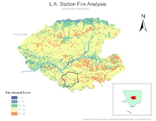
This map graphically displays the fire risk of the entire 2009 LA Station Fire area-- the region mapped is the entire area that was burned in the fire over the first five days. The map's data is from 2006 and 2008, meaning that the data should generally be consistent with the conditions prior to the LA Station Fire. The ‘Fire Hazard Score’ in the lower left hand corner incorporates slope and surface fuel type into the final score. A small score is a low fire risk area whereas a large score is high fire risk area. The small outlined portion is the extent of the fire at Day 1 (8/29/2009) and the entire colored region is the total extent of the station fire. To give map viewers a perspective on the size of the Station Fire, an inset map of LA County was provided. For reference, Big Tujunga Canyon Stream and Mill Creek were also plotted on the map.


The first step in creating this map was completing a similar tutorial provided by ESRI. The tutorial provided a walk-through of the primary steps necessary to complete the map. I was able to find GIS data from a variety of sources: UCLA GIS data (streams and county boundary), LA County Data (station fire perimeter), CA Fire Resource Assessment Program (surface fuels), and the USGS Seamless Server (elevation data). First, I merged the five day fire extent into one cumulative layer. Second, I made a hill shade layer to get a better feel for the study area. Next, I reclassified the surface fuel types so that more flammable vegetation types received higher scores. The same was done for the slope (higher slopes were deemed higher fire risks). Lastly, these scores were summed using the raster calculator and the final result is seen above.


I encountered a variety of problems in making this map. First, when I tried using the cumulative fire area as a mask, my result for slope was impossibly high-- I calculated changes of over 2 million percent. I found that if I used the LA County feature as a mask, this problem could be circumvented. Another problem I encountered was that I was not exactly sure how the surface fuel types/slope changes should be scored. I generally followed the tutorial for these scores, but some of the values were made using my best judgment. The last problem I encountered was independent of the GIS program—I had an inconsistent remote access connection with the UCLA lab computer.